our logo.

This is the primary IMPAPER logo.
To maintain the integrity of the brand, please refrain from compromising the overall look of the logo by rotating, skewing, transforming, or distorting in any way – which includes adding extra graphics.


Here is a short & brief guideline for featuring our brand! Let us know if you have any other questions or if you need more assets from us 🙂
This is the primary IMPAPER logo.
To maintain the integrity of the brand, please refrain from compromising the overall look of the logo by rotating, skewing, transforming, or distorting in any way – which includes adding extra graphics.

C0 M19 Y100 K0
R255 G205 B5
#FFCC04
IMPAPER Yellow is our primary brand colour, with our full colour palette consisting of soft pastel colours.
You can view our full colour palette below!

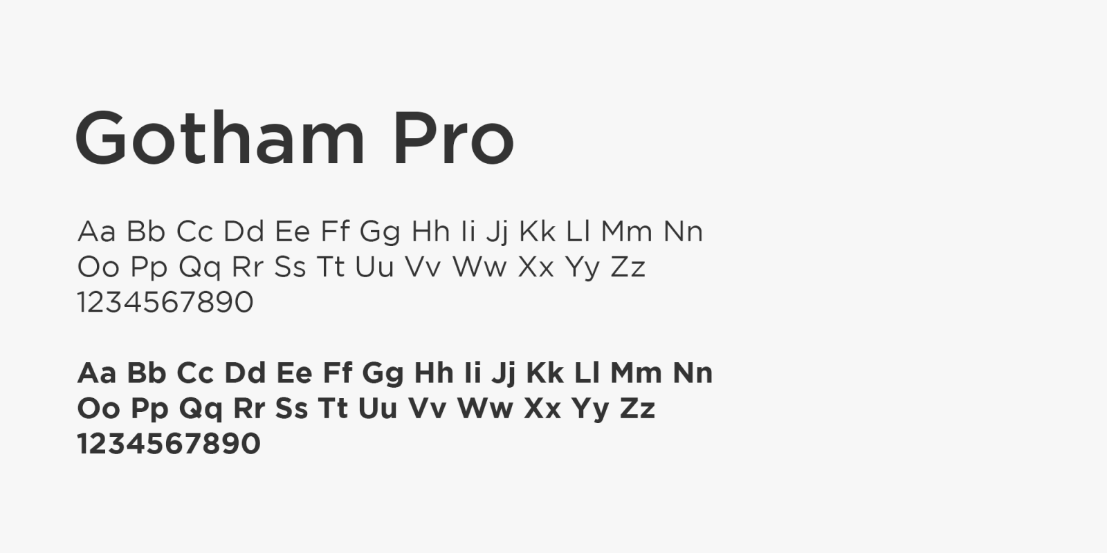
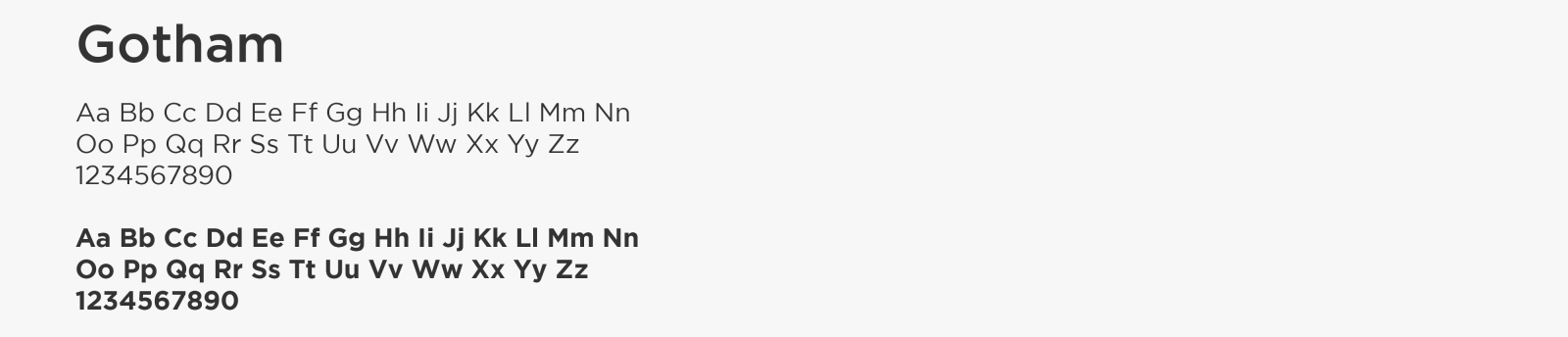
Our primary typeface is Gotham in both the Book and Bold weight.
Our two brand taglines are as follows:
Give a Card that Gives. (which should be used only for materials that are featuring our greeting cards)
Designed to Change Lives. (which should be used for materials that feature product categories outside of greeting cards)